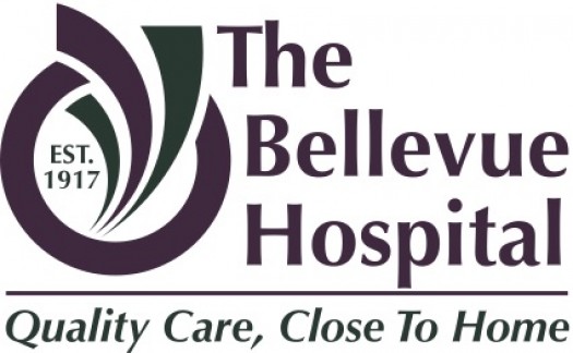
The Bellevue Hospital is in an exciting time of new growth and development, while still reflecting upon our historical achievement of more than a Century of Caring. The development of a new logo marks this special time of blending the celebration of our future while honoring our past.
The beginning of our logo is a circle. Circles have no beginning or end and represent the cycles of life. An aerial view of our grounds show the circular patterns of our hospital building; the road encompassing our hospital named “Winthrop Way;” and the circular design of our Wellness and Walking trail. Our logo’s circle not only represents the building and grounds of the hospital, but more importantly, the people who care and are cared for, contained within.
From within the circle, three markers represent growth and direction from our core seeking innovative ways to improve the health of the communities we serve. Each marker symbolizes an aspect of the hospital. (Left - Bellevue Professional Services; Center - The Bellevue Hospital Foundation; and Right - Community Health & Outreach.)
Our colors will remain the same, taken from the natural surroundings of our prairie-style hospital: Aubergine - seen within the colors of the sky and Hunter Green - the color of our landscape.
Finally, we honor and recognize the year The Bellevue Hospital opened its doors, 1917, to provide “Quality Care, Close to Home.”
We are excited to introduce this new image and branding to the communities we serve.